ODI Brand Identity

Over 35 years ago, ODI revolutionized the BMX industry with its iconic grips, setting a new standard for innovation and performance. Built on expertise, passion, and precision in-house manufacturing, ODI has since expanded into a range of categories including Mountain Biking, Motocross, ATV, and Watercraft.
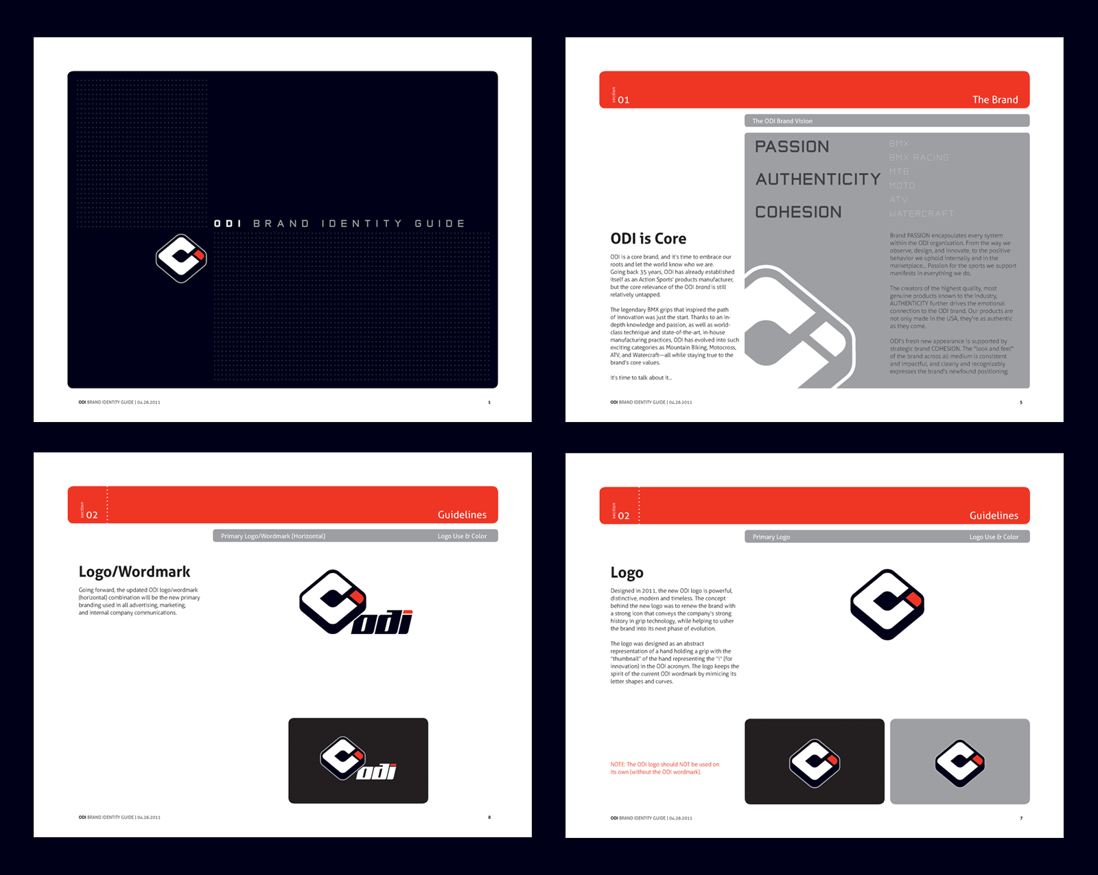
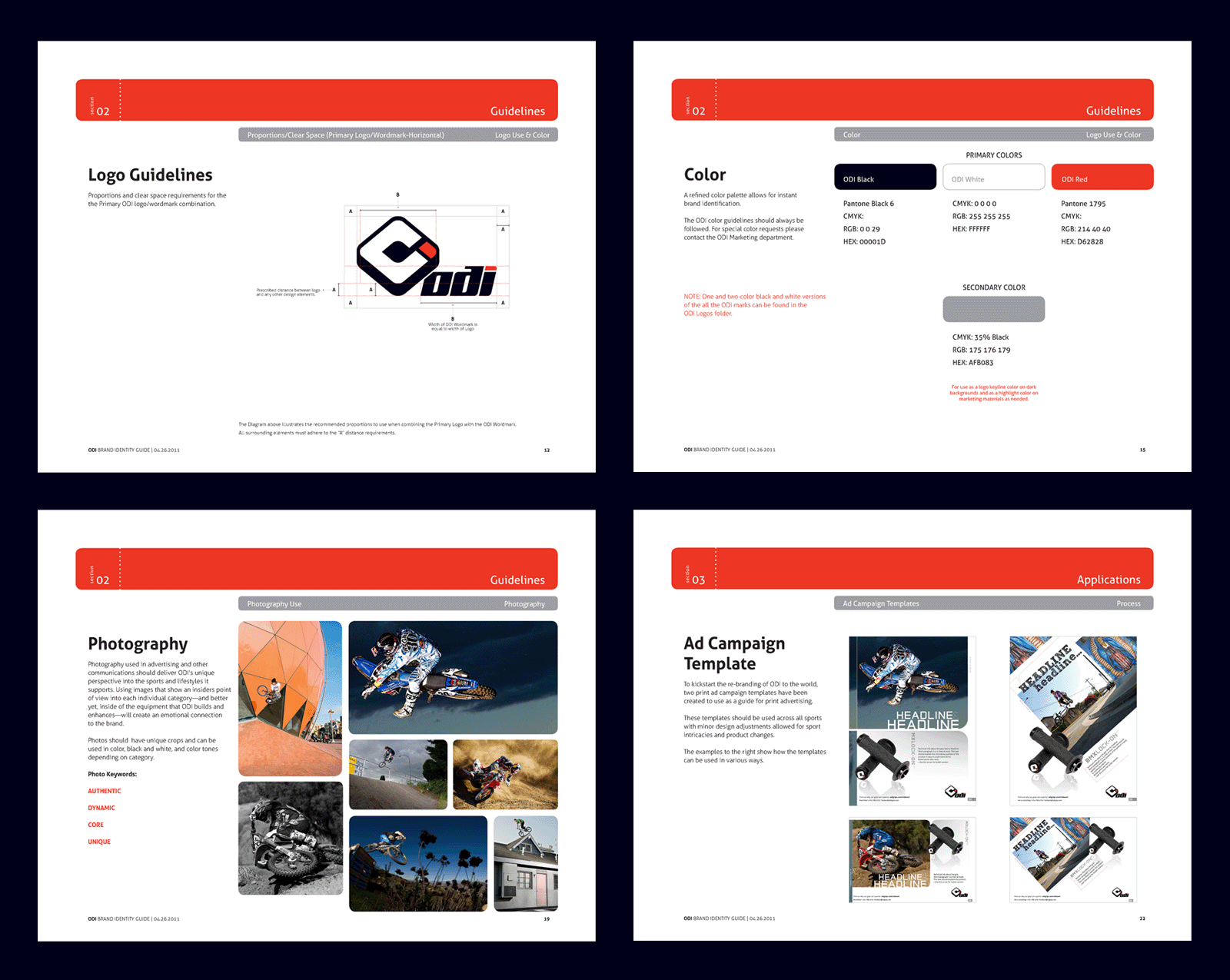
To reflect this spirit of progression, a full-scale rebrand was undertaken—introducing a new logo, brand guide, color palette, ad campaign designs, website look and feel, presentation templates, and copywriting.
The redesigned logo is a geometric abstraction inspired by the visual of a hand gripping a handlebar. It merges the letters O, D, and I into a unified symbol using negative space and dynamic angularity to reflect movement, control, and strength. The mark balances symmetry and tension, evoking the tactile experience of riding while reinforcing the brand’s roots in grip design. Engineered for versatility, the logo scales cleanly across applications—from product molds and packaging to digital interfaces—ensuring strong brand recognition at every touchpoint.
- Services: Brand Strategy and Identity Guide, Art Direction, Logo Design, Icon Design, Website Design, UI, UX, Copywriting
