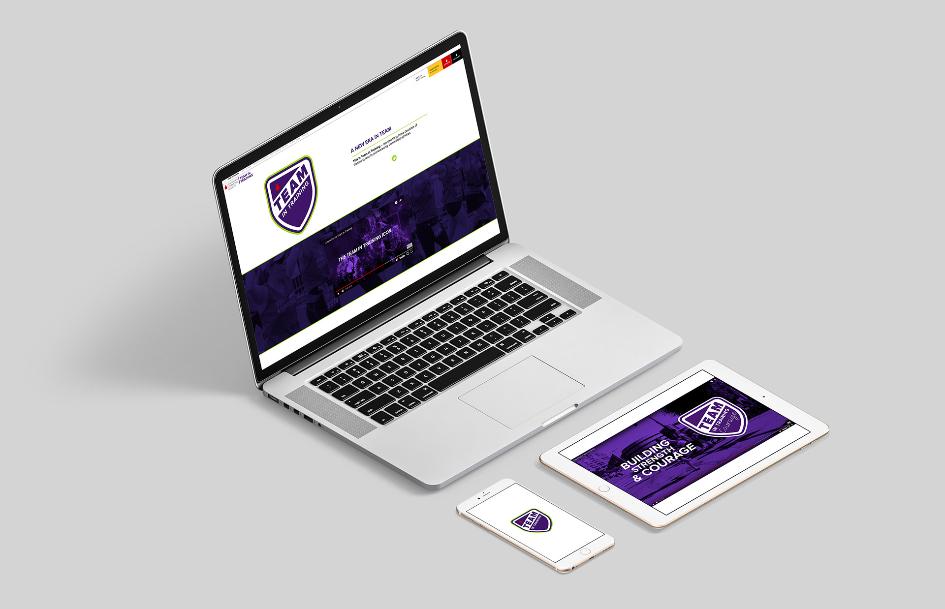
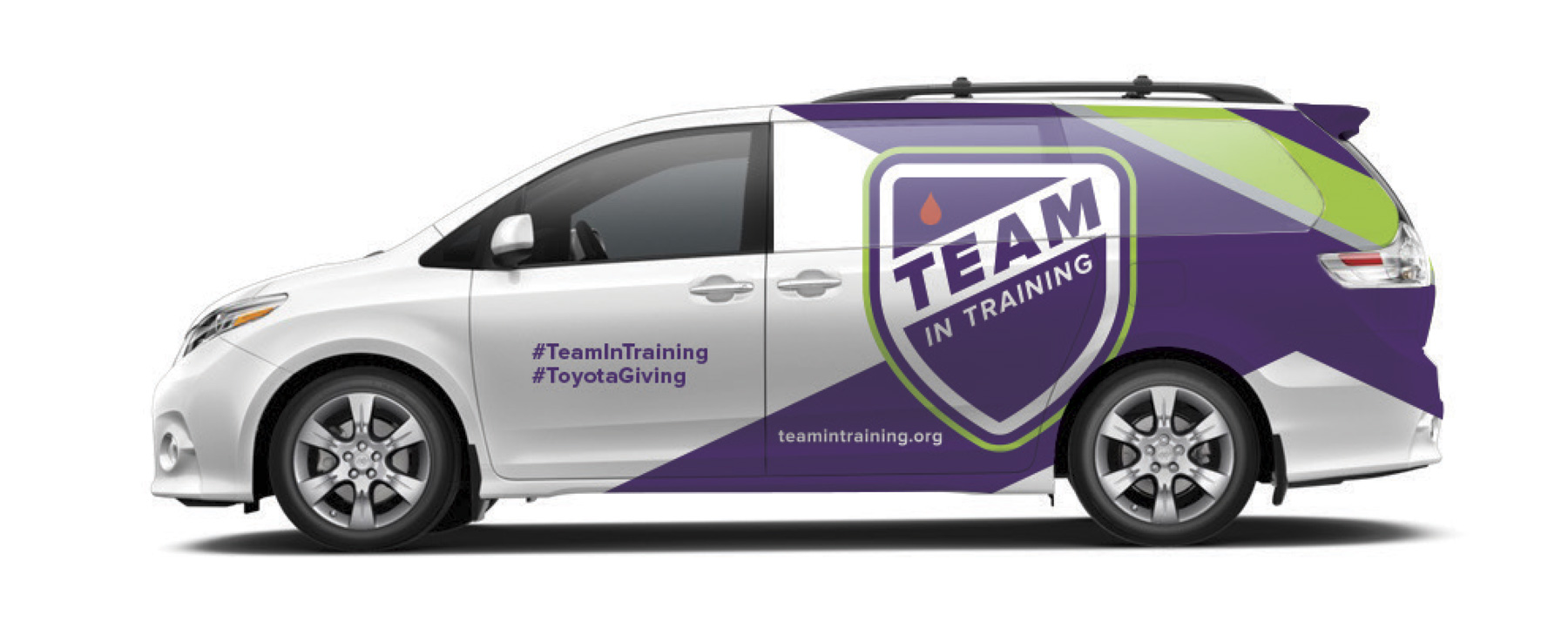
Team In Training Brand Identity
Since 1988, Team In Training has raised over $1 billion for The Leukemia & Lymphoma Society, transforming endurance sports through purpose-driven participation. To celebrate its 30th anniversary and strengthen its future impact, we led a full rebrand focused on clarity, consistency, and emotional resonance.
At the center of the new identity is a bold shield logo—symbolizing protection, strength, and support. The redesigned mark features the “Team In Training” wordmark and integrates the signature LLS drop, visually connecting the program to its mission.
The color palette carries layered meaning:
-
Red represents the mission—cutting-edge progress in cancer research.
-
Green honors survivors—the inspiration behind every athlete’s journey.
-
Purple embodies the team-first spirit—the heart of the TNT community.
Together, the new identity system modernizes the brand while staying rooted in its legacy of impact, unity, and hope.
- Services: Brand Strategy, Art Direction, Design, Digital and Print Advertising, Photography, Video Production


